The EclipseCon starts today in France. And for this special occasion we are landing a new version of the open analytics platform for Eclipse today. This is intended to be used for community purposes, but also for engineering teams and for those curious about how this community performs over time and nowadays. Luis Cañas will talk about this during the Conference, do not miss his talk!
The entry point for the dashboard is the Overview page. There a summary of each of the available data sources is displayed together with some filters that help to understand the evolution and current state of the activity and the community of Eclipse.
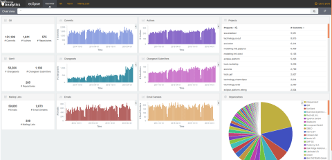
This panel is divided into two main sides:
- Left side
- It is based on three panels each row. And each row gives information about the summary of that specific data source [Git, Gerrit and Mailing lists is the current order)] while the two evolutionary charts display information about the activity and community respectively. For the displayed example, there are three rows and three columns in the left side of the screenshot. Each row represents a different data source, while each column represents a different piece of information [Main facts, activity and community evolution].
- Right side of the panel
- There are filters that help to navigate this summary panel. The first big table is a list of projects available for the Eclipse project. Any of those projects can be selected easily with the mouse and the rest of the panel will be updated according to that filter. The second filter is provided by the big pie chart related to organizations. Although it is not recommended to use this type of charts for that big spread amount of data, the goal with represented in such way the organizations is to show the ‘Elephant factor’. This is defined as the number of companies that are leading a project up to it’s 50% of the total activity. As we can see, the diversity of the Eclipse projects is quite high (at least if compared to others!) where the Elephant factor is 5. This means that 5 organizations (in this case including independent developers) are leading the project.
Finally, it is worth mentioning the filter for the time of analysis. At the very top right of the panel there is a specified timeframe (Last 2 years in this case), but when selected, a new menu is displayed. Then we can choose other timeframes (perhaps last 15 years or perhaps the last week) and the panel will be updated according to this new filter.
All in all, the good point about this technology is that more than one filter can be applied at the same time providing a great drill down information process.
Regarding to the structure of the panel, you have probably noticed that there’s a gap at the very end of the panel. Once we have other data sources ready to go, we’ll keep adding rows. The next one is the Bugzilla information, so please keep in touch ;).
Git, Gerrit and Mailing lists specific panels
Then there are three more panels with useful information related to the development activity of the Eclipse Foundation: Git, Gerrit and Mailing lists.
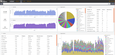
All of them show a similar structure. The entry panel (there’s some extra info at the bottom in any case) shows information again divided into left side and right side. The left side contains information about facts of the Git development plus two evolutionary bar charts [top left side], while the bottom left side shows the list of authors involved in such development with specific metrics of interest: commits, projects they have participated in, added lines, removed lines and average number of files ‘touched’ by commit.
The right side of the panel displays information about Organizations and Projects. Those can be used for filtering purposes, but also to check the diversity of the Git development activity in terms of organizations. The bottom right chart full or bars and colours represents the evolution of the organizations in the project. At least two main colours can be observed: those for Independent and for IBM what provides an idea of the project is lead in terms of organizations. Indeed the pie chart provides extra information about those organizations and this idea of the ‘Elephant factor’. As similarly done in the Overview panel, any widget is potentially clickable, what helps to filter by any type of information the panel (organization, author, timeframe, project, and others).
The rest of the panels display similar information so it is recommended to have a look at the Gerrit and Mailing lists panels.
We’re also producing right now specific panels for extra help and engineering. The latter is focused on the backlog of Gerrit providing direct links to the original Gerrit project and metrics about its current development such as the total time open, developers involved and others. As this information can be filtered and shared with third parties, we believe that this is a complete and powerful tool to focus the development team on the specific changesets that follow a particular filter process. Please, be aware of these changes when checking the dashboard.
One more thing…
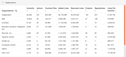
Last but not least, for the specific case of the Git panel, there is a new table focused on the organizations activity. If you scroll down in the Git panel, at the very bottom in the left side you’ll find a table named as Organizations that provides several columns of information: commits, authors, touched files, added lines, removed lines, projects, repositories and average number of lines per commit.
This information can be used for reporting purposes, but also to check the status of several projects (if filtered by) or by a specific timeframe of activity (for example 2014).
As usual, feedback is really appreciated. As this is work in progress, if you feel we’re missing important information in the dashboard, please let us know.
Check our Development Analytics products and services or play with Cauldron.io (test it for FREE using OSCON16 as invitation code)


