One of the first tasks done by a developer during the day is to choose where to go and what to fix. Backlogs are quite useful for this purpose, either using Kanban and directly having a look at the open issues waiting lists project by project as in the case of GitHub, or using any other manual or automated method.
For this engineering focus we have started to produce some panels whose main purpose is to help developers to make decisions. As this is still in its first stages there is room for improvement, but this hopefully shows how powerful this could be. The displayed panel is part of the open analytics panel produced for the CoreOS community.
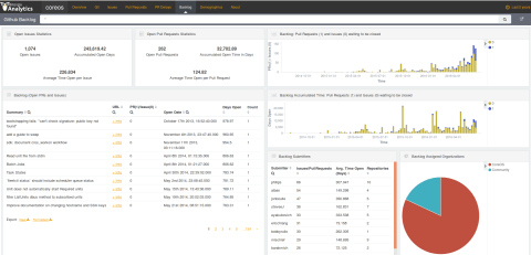
This panel aims at providing information at three main levels:
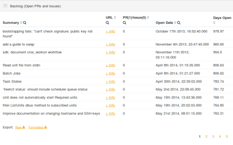
- Current situation of the backlog. This can be mainly visualized in the top two tables working as a summary for the pull requests and issues in GitHub together with the big table that contains information about each of the open issues. The links to the actual ticket in the various GitHub repositories can also be seen. This example displays aggregated information for all of the projects found in GitHub for the CoreOS organization. That means that you do not need to navigate through all of the projects to have an aggregated view of the entire project. Indeed, it is possible to filter by project, submitter, period of time or even type of community (CoreOS or Community in this case) to drill down to the required project or community member.
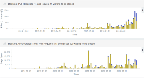
- Technical debt (let me extrapolate this concept!) in terms of the accumulated time that the issues or pull requests have remained open in the project. The two bar charts in the top right display the same history, but with a different metric. The first table at the top shows information about the current backlog of open issues and pull requests (this can also be filtered thanks to Kibana capabilities). And this is counting issues per period of time. The second bar chart displays the accumulated time for all of the issues still open in that activity timeframe. Having this in mind helps to understand why there are peaks in the second bar chart: the older a pull request or an issue is, the more time they accumulate without being closed.
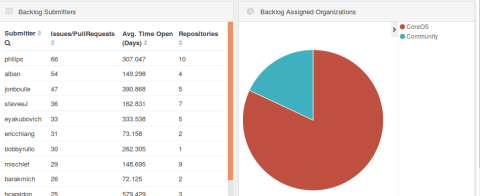
- The community behind such backlog as submitters and assigned organizations. The two remaining charts, the table and the pie chart at the bottom right of the panel displays information about the submitters and the organizations assigned to fix those issues and pull requests. This helps to make a difference when working with communities oriented to non-hired developers, helping them to progress in the project as soon as possible.
As a summary, this panel helps to understand the current backlog through three main concepts: the community, the accumulated open time of the issues and the list of open issues and pull requests. As mentioned, this was done for the CoreOS community, but we’re also working on adding other data sources. Jira and Bugzilla are two of those that are already supported and with their own panels to display this very same information.
The panels displayed in the CoreOS dashboard are available in the panels project under the GrimoireLab organization in GitHub.
As usual, feedback is more than welcome!


