Community managers spend their time in numerous community activities related with his/her main role: to get people to talk and contribute, react to the community managed, keep people engaged, etc. Key Performance Indicators (KPIs) should be set for each community based on its goals. It’s part of the job to elaborate reports with multiple metrics on community health for example. But, measuring should be an effective task.
Keeping this in mind, I’d like to share with you 5 reasons about why community managers or any other professional related with software development should have a dashboard that provides all the data about the community or project that she/he manages:
- You don’t want to waste your time on gathering and processing data.If your role is to manage a community, your main activities should be related with wading (not diving) into community: listen and talk to the community and get it engaged, not to spend too much time trying to get data from several data sources, but taking decisions based on the data. Getting a tool can help you to minimize the time wasted on collecting all the data and to be focus on your activity.
- All community data in one place.Sofwtare development communities use a bunch of different tools, and it’s hard to get valuable aggregated metrics from many of them. There are open source analytic tools in the market to help companies and communities to put all the data in one place, so everyday you can take a look and have an overview on the big numbers on basic metrics (like size, demographics, performance, activity, diversity). A dashboard that shows activity and metrics about source code, tickets/issues, code review, discussions, chats, continuous integration, and downloads, provides a first view of how much the community is doing, and can be used to track different kinds of activity, and allow you to drill down into the details.
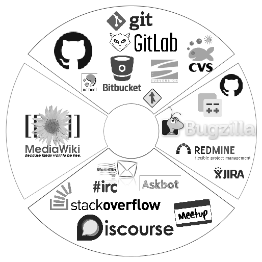
Some development communities tools - Profile your community participants and contributors.Having a dashboard where you can get quickly metrics related with community growth, community attraction, engagement,… is an easy way to identify who is joining, and key and emerging contributors.But it also shows who is participating less before he/she leaves the community. Maybe you want to send an email to ask if everything is ok and try to find out why the participation is decreasing, it could be personal reasons or something that had that person stacked at some point. But you need the data in advance to anticipate any issue.

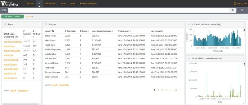
Community git contributions - Overall processes performance of the community. Measure quantity and quality.It highlights issues and bottlenecks, allowing them to be resolved before they grow or spread. You can analyze how processes are performing. For example, you can measure how long processes take to finish; time to resolve or close tickets shows how the project is reacting to new information that requires action; time spent in code review.Not all is about if a number grows, probably you want to have insights on contributors’ profiling and quality participation, and that is revealed in the sum-total of other metrics and data.
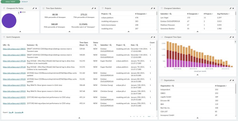
Last 2 years Gerrit backlog, from one of our WiP projects - Trends over the time.It’s not only what is happening today, it is what is happening over the time and the evolution of your community. Which was the diversity of the community two years ago compared with last month on the code review process? The answers to that kind of question provides important information about the evolution and work done in the community. But not only that, people evolve over the time and contributors do it too. We can closely see how a contributor changes his/her role over the time, for example, from active code contributor to a management profile, but only if you have data from several source that allows you to do that analysis.
All these things are easier if you have a dashboard that provides all that data aggregated that let you filter and drill down into details. It would let you focus in your job: to manage the community and stay connected to them, and don’t waste time trying to gather all the data. Check an example of the Eclipse Foundation community activity.

