Open source projects issues deal with community health and activity: how to get people to contribute or how to keep people engaged are common activities for community managers. Thus, key Performance Indicators (KPIs) should be set for each community based on those goals.
GrimoireLab is a free open source toolkit supported by Bitergia and used to analyze open source and inner source development communities. You can analyze community structure by using onion model panels for different purposes. In order to understand these panels, we have defined a set of use cases to guide you in your journey to get the best possible outcome. Let’s now take a look at them:
Onion model for the whole community
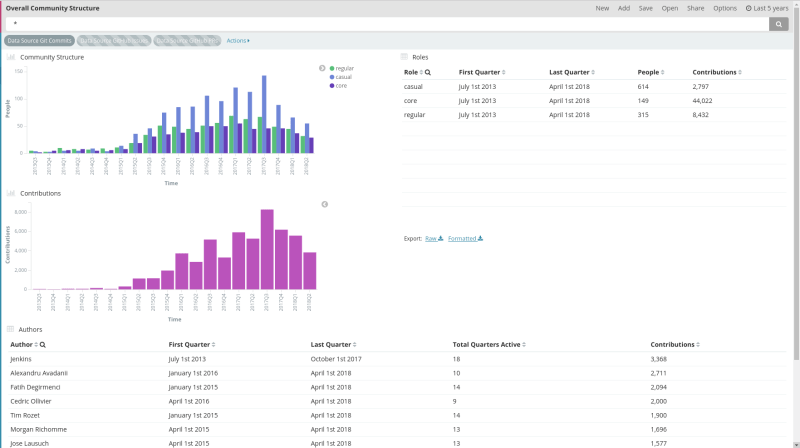
This panel shows the results of computing onion for all contributions in a given data source.
On the top left corner we find the evolution of the different onion roles through time, divided in quarters. Just below, another bar chart shows the evolution of contributions in such a way one can compare both to better understand how groups evolve.
On the right hand side there is a table showing number of people and contributions by role for the selected time frame.
The bottom of the panel contains a table of authors, showing the total number of contributions of each one in the selected time frame together with the number of quarters that author has been active in the community.
Onion model for a given organization
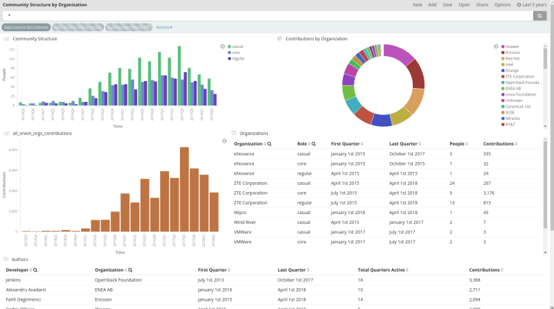
This panel splits data into organizations. Onion model is computed individually for each organization.
In order to have meaningful data, we need to select the organization we are interested in from the donut chart on top right corner or from organizations table just below. Then, a new filter will appear on top, next to the other ones, and we’ll get the data we need in the panel.
Onion model for a given project
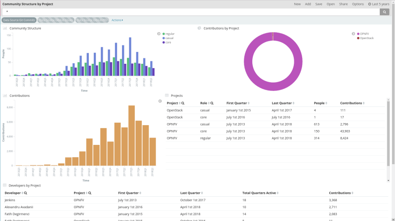
This panel splits data into projects. Onion model is computed individually for each project.
In order to have meaningful data, we need to select the project we are interested in from the donut chart on top right corner or from projects table just below. Then, a new filter will appear on top, next to the other ones, and we’ll get the data we need in the panel.
Why Bitergia analytics?
Understand which KPIs are the best ones to analyze, generate customized panels for your specific needs and save time with all processes related with data gathering, data curation and data visualization is something Bitergia can do for you. If you are looking for the best results in your projects, contact us!


